Category: Web Desiging Services

  • Headless, Fast, and Trackable: Building Real-Time Client Portals for Logistics Companies

    Headless, Fast, and Trackable: Building Real-Time Client Portals for Logistics Companies

    Shippers don’t want another brochure site—they want answers: Where is my consignment? What’s the ETA? Where’s the PoD? That’s why forwarders and 3PLs in Telangana are prioritizing logistics website with live tracking development Hyderabad projects that deliver real-time visibility, self-service documents, and proactive alerts. The most reliable way to ship this quickly—and scale across branches and partners—is to decouple content from data with a headless CMS for 3PL websites India. Pair that with a robust API layer and you’ll have the foundation for high-speed B2B client portal development for logistics Hyderabad that actually moves the needle.

    Grow Business

    Why headless wins for logistics

    Legacy, page-builder-style sites can’t keep up with fast-changing ops. A headless CMS for 3PL websites India separates your front end (React/Next.js) from content APIs, letting marketers publish service pages, tariffs, FAQs, and alerts without touching code, while engineers focus on tracking, orders, and billing. For multi-branch networks and agent models, this unlocks faster localization and brand control. Most importantly, headless plays nicely with TMS/WMS, telematics, and ERP connectors—the core of any B2B client portal development for logistics Hyderabad initiative.

    Real-time tracking that reduces WISMO

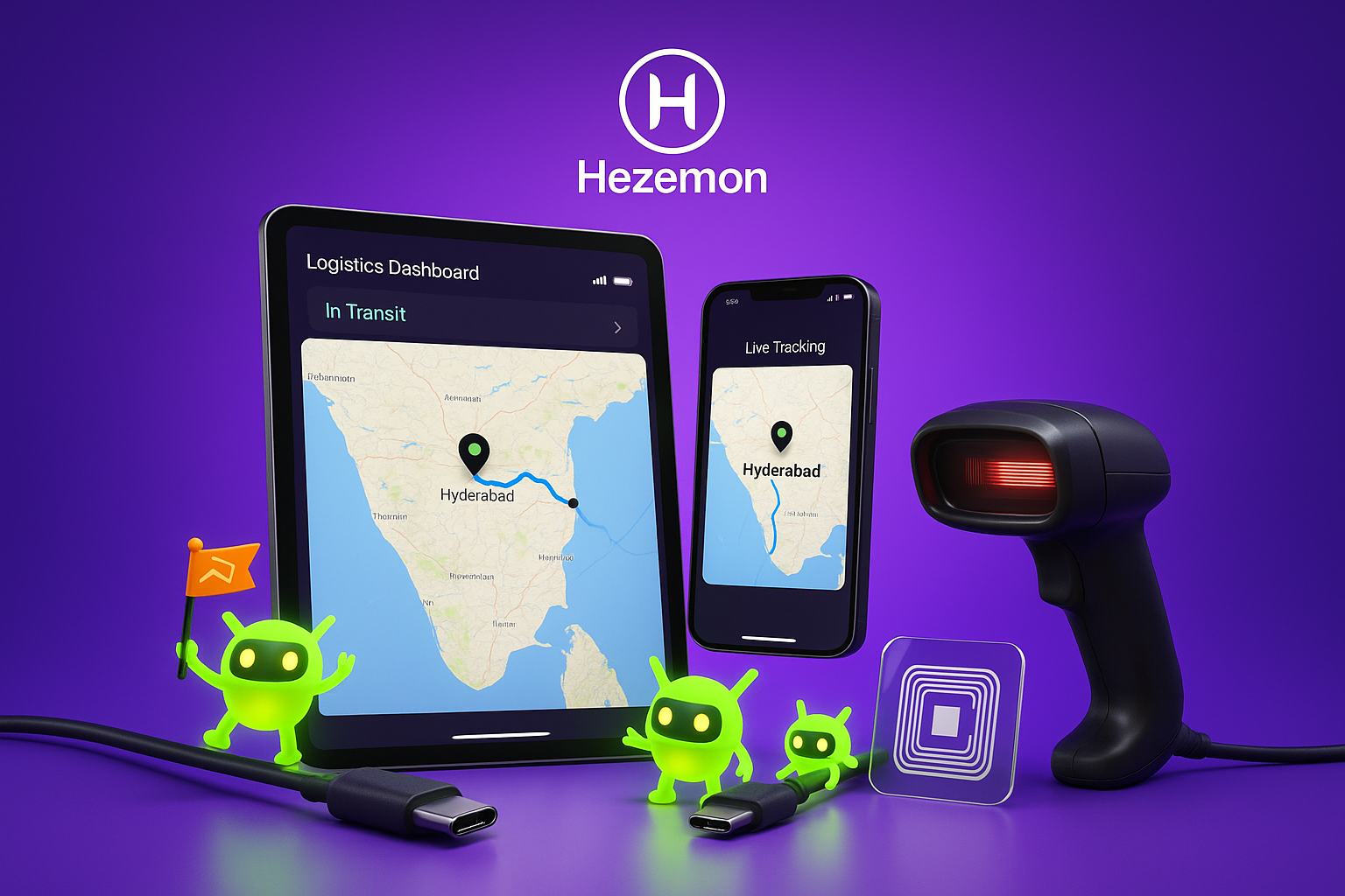
    The heart of a logistics website with live tracking development Hyderabad build is a single source of truth for shipments. Unify GPS/ELD pings, driver app events, and geofences into a timeline that anyone—shipper, consignee, finance—can understand. Display live location on a map, stop-level ETAs, dwell time, and exception flags (delay, diversion, temperature breach). Trigger WhatsApp/SMS/email notifications at pickup, in-transit, exception, out-for-delivery, and delivered. These features lower “Where is my order?” calls by 30–50% and make your portal the first tab a customer opens every morning.

    The reference stack (proven and practical)

    For dependable B2B client portal development for logistics Hyderabad, use a simple, scalable pattern:

    • Front end: Next.js for fast SSR and smooth client transitions
    • Content: A headless CMS for 3PL websites India with models for lanes, services, surcharges, and help docs
    • APIs: microservices for tracking, orders/documents (PoD, invoices), and notifications
    • Data: relational DB for transactions; analytics store for lane performance and SLA reports
    • Security: OAuth2/SSO, role-based access (shipper, consignee, branch, partner), signed URLs for documents

    This keeps the UI blazing while your ops team keeps adding routes, agents, and value-added services without re-deploys—exactly what a logistics website with live tracking development Hyderabad needs.

    The 90-day rollout plan

    Weeks 1–2: Discovery & KPIs. Align on SLAs (on-time %, response time), data sources, and the MVP: live tracking, shipment search, PoD visibility. Confirm the headless CMS for 3PL websites India so marketing can start structuring content now.

    Weeks 3–6: Foundations. Build auth and RBAC, wire the tracking aggregator, render a live map with event timelines, and ingest historic shipments for context. Publish core service pages through the CMS. Your B2B client portal development for logistics Hyderabad now has a usable spine.

    Weeks 7–10: Self-service workflows. Add rate-quote to booking, shipment creation, document center (BL/PoD/invoices), and claims intake. Configure WhatsApp/SMS/email triggers. This phase cements your logistics website with live tracking development Hyderabad as a daily driver for customers.

    Weeks 11–13: Analytics & hardening. Dashboards for lane performance, dwell time, exception reasons; load testing; security scans; multilingual content. The headless CMS for 3PL websites India lets you publish localized guides and seasonal surcharges quickly.

    What good looks like (UX essentials)

    • Shipment search that thinks like ops: by reference, PO, consignee, lane, vehicle.
    • Readable milestones: fewer data dumps, more human-friendly statuses.
    • One-click documents: signed URLs for PoD and invoices; no inbox hunting.
    • Predictive ETAs: combine historical lane data with live traffic for fewer surprises.
    • Accessible on the move: responsive design, offline-aware driver flows where needed.

    Nail these and your B2B client portal development for logistics Hyderabad won’t just inform—it will reassure.

    Security, compliance, and reliability

    Freight data is sensitive. Use TLS everywhere, rotate keys, and apply least-privilege access. Keep immutable audit logs for every event and user action. Define RPO/RTO and run quarterly recovery drills. When your logistics website with live tracking development Hyderabad handles cross-border documentation, maintain retention policies aligned to customs and taxation rules. Enterprise buyers will ask; be ready to show it.

    Content velocity = commercial velocity

    Winning lanes requires speed—not just in trucks, but in messaging. With a headless CMS for 3PL websites India, your team can spin up landing pages for new corridors, festival surcharges, value-added services (FTL/LTL, cold chain, white-glove) and localize them for Hyderabad, Vizag, or Pune without developer wait time. More relevant pages mean more high-intent traffic and smoother hand-offs to sales.

    Measuring ROI that matters

    Track outcomes, not pageviews. A well-executed B2B client portal development for logistics Hyderabad typically sees:

    • Fewer WISMO tickets via live tracking and proactive alerts
    • Faster dispute resolution through digitized event trails and PoD access
    • Higher repeat bookings thanks to self-service convenience
    • Lower cost-to-serve as ops spends less time answering routine emails

    When customers log in and stay, the portal is paying for itself.

    The takeaway

    If reliability and speed are your brand, your tech must reflect it. A logistics website with live tracking development Hyderabad powered by a headless CMS for 3PL websites India and clean APIs gives you the agility to serve today’s shipments and tomorrow’s growth. Treat the portal as a product—iterate weekly, publish often, and keep reducing friction. That’s how modern 3PLs turn visibility into loyalty and B2B client portal development for logistics Hyderabad into a durable competitive edge.

  • Pocket Presence: How to Make Your Brand Mobile-First and Memorable

    Pocket Presence: How to Make Your Brand Mobile-First and Memorable

    In today’s fast-paced digital world, your brand’s mobile presence  isn’t a “nice to have” — it’s a must-have. With over 60% of all online traffic coming from smartphones and tablets, small businesses that fail to invest in mobile-friendly website development risk losing potential customers before they even engage. Whether you’re a boutique retailer, a local restaurant, or a service provider, adopting a mobile-first website approach ensures your brand stays relevant, accessible, and memorable.

    Why Mobile-Friendly Website Development is Crucial for Small Businesses

    For small businesses, every customer interaction counts. A slow, unresponsive, or poorly optimized website can instantly drive visitors away. Mobile-friendly website development for small businesses is about more than just shrinking a desktop site to fit a phone screen. It’s about designing with mobile users in mind from the very beginning — ensuring fast loading times, clear navigation, and a user experience tailored for small screens.

    Grow Business

    A mobile-first website ensures:

    • Improved user experience (UX): Visitors can find what they need quickly without pinching, zooming, or scrolling excessively.
    • Higher search engine rankings: Google prioritizes mobile-friendly websites in its rankings.
    • Better conversion rates: A seamless mobile experience encourages visitors to take action — whether that’s buying, booking, or contacting you.

    Best Practices for Creating Mobile-First Websites

    Creating a mobile-first design means planning for the smallest screen first and then scaling up for larger devices. Here are some best practices for creating mobile-first websites that can help small businesses stand out:

    1. Start with Mobile-First Design Principles

    Instead of designing a full desktop site and then adapting it for mobile, begin with a mobile layout. Focus on:

    • Simple, clean designs
    • Prioritized content
    • Large, tap-friendly buttons
    • Minimal text entry
    1. Optimize for Speed

    Mobile users are often on slower connections. Optimize images, use lightweight code, and enable caching to improve load times. In mobile-friendly website development, speed is a direct driver of user satisfaction and conversions.

    1. Responsive Web Design

    Implement responsive web design techniques so your website automatically adjusts to any screen size — from small smartphones to large desktop monitors. This approach ensures consistent branding and usability across devices.

    4. Clear Navigation

    Menus should be easy to use on small screens. Consider using hamburger menus, sticky navigation bars, or collapsible sections to save space without sacrificing accessibility.

    1. Touch-Friendly Elements

    All clickable elements should be big enough to tap easily without accidentally hitting something else. This is a cornerstone of best practices for creating mobile-first websites.

    Improving User Experience with Responsive Web Design

    User experience (UX) is at the heart of successful mobile-friendly website development for small businesses. A responsive web design ensures that no matter what device your visitors use, they have an equally smooth experience.

    Consistent Branding Across Devices

    Responsive web design keeps your brand’s look and feel consistent across smartphones, tablets, and desktops. Customers recognize your brand instantly, regardless of how they access your site.

    Easy Content Consumption

    Mobile users often scan rather than read. Use short paragraphs, bullet points, and high-quality visuals to make your content more digestible.

    Faster Engagement

    With a mobile-first approach, you remove barriers between the visitor and their desired action. Fewer clicks, more intuitive layouts, and clear calls-to-action result in faster conversions.

    How to Implement Mobile-Friendly Website Development for Your Business

    For small businesses ready to embrace a mobile-first website, here’s a step-by-step approach:

    1. Audit Your Current Website

    Test your site on multiple devices and screen sizes. Tools like Google’s Mobile-Friendly Test can highlight issues affecting mobile usability.

    1. Choose a Mobile-Friendly CMS or Framework

    Many content management systems (CMS) like WordPress, Wix, or Shopify offer mobile-friendly website development themes with built-in responsive web design.

    1. Work with a Mobile-First Designer or Developer

    Hire someone who understands best practices for creating mobile-first websites and can implement them effectively.

    1. Prioritize Core Features

    Identify the top actions your mobile visitors take — whether it’s finding contact details, booking a service, or purchasing a product — and make those features highly visible and easy to access.

    1. Test

    Conduct user testing across devices to ensure your responsive web design  works flawlessly.

    The Competitive Advantage of Going Mobile-First

    Small businesses that prioritize mobile-friendly website development gain a significant edge. They create mobile-first websites that load quickly, offer seamless navigation, and present content in an engaging way — all of which increase customer satisfaction and brand loyalty.

    In a world where attention spans are short and competition is fierce, a well-designed responsive web design isn’t just about keeping up with trends — it’s about future-proofing your brand. By following best practices for creating mobile-first websites, you not only improve user experience but also enhance your visibility in search engines, leading to more traffic and higher conversions.

    Final Takeaway

    Mobile-friendly website development for small businesses  isn’t a luxury anymore — it’s the foundation of your brand’s online presence. Implement responsive web design, follow best practices for creating mobile-first websites, and you’ll transform your online presence into a powerful, pocket-sized marketing machine that customers will remember.


  • Stop Letting Your Website Rot Like a Forgotten Potato — Make It a Sales Assassin

    Stop Letting Your Website Rot Like a Forgotten Potato — Make It a Sales Assassin

    Your website is not a trophy to sit on a digital shelf.
    It’s your high-converting business website, a 24/7 sales-driven website design that should be making you money every single day… or at least, it should be.

    But here’s the problem:
    Too many businesses launch their site, pat themselves on the back, and then let it gather digital dust — while competitors’ professional website development services are building sites that hustle non-stop, steal customers, and cash in.

    A website optimized for lead generation doesn’t just look pretty.
    It stalks your ideal customer, grabs their attention in seconds, and doesn’t let go until they click buy, book, or sign up.

    How to Weaponize Your Website for Maximum Conversions

    1. Dominate the First 5 Seconds

    Visitors make up their mind fast. Your headline should hit like a sniper shot: Who are you? What do you do? Why should they trust you with their money? This is where website conversion optimization starts.

    2. Control the Clicks

    Every page should have one clear mission. Remove every dead-end and force a single, irresistible next step. This is core to sales-focused website development.

    3. Sell the Dream, Not the Drill

    Nobody wakes up wanting “web design” or “consulting.” They want more sales, more freedom, more success. Sell that, and watch your website optimization for lead generation skyrocket.

    4. Make Trust Unavoidable

    Case studies, client logos, reviews — put them front and center like battle medals. Trust is one of the most powerful conversion rate optimization tools you have.

    5. Cut the Load Time or Kill the Deal

    If your site is slow or clunky, you’re not losing seconds — you’re losing customers. A high-converting business website must be lightning-fast, mobile-friendly, and frictionless.

    Your Website Should Be the Ultimate Closer

    It’s the kind of salesperson who never sleeps, never takes a sick day, and never asks for a raise.

    If it’s not working like that, it’s not a website.
    It’s a liability.

    Stop letting it rot.
    Invest in professional website development services that turn your site into a sales machine.
    Make it lethal.

  • Website Redesign: Should You Rebrand or Start Fresh

    Website Redesign: Should You Rebrand or Start Fresh

    In today’s digital-first world, your website is more than just a virtual storefront—it’s your brand’s most powerful marketing tool. But what if it’s not generating the traffic, engagement, or conversions you expect? Should you give it a facelift or build something entirely new?

    At Hezemon, a leading web designing company in Hyderabad, we’ve helped hundreds of small and medium-sized businesses assess this exact question. In this blog, we break down whether you should redesign your website or rebrand completely, and how to do either effectively using the latest design practices and technology.

    Why Your Website Might Be Holding You Back

    You may already have a functional website—your pages load, contact forms work, and you have all the information in place. But functionality doesn’t automatically translate to visibility, engagement, or credibility in the modern marketplace.

    Here’s why your current website might be underperforming:

    • Outdated Look & Feel: If your design feels old-school, customers will subconsciously assume your business is too.
    • Not Mobile Responsive: With over 60% of users accessing websites via smartphones, a non-mobile-friendly site can lead to massive drop-offs.
    • Poor Search Engine Visibility: If your website is invisible on Google’s first page, you’re virtually non-existent to potential clients.
    • Unclear Brand Messaging: If your site doesn’t clearly communicate who you are, what you do, and why you’re the best, you lose customer trust.
    • Low Conversion Rates: Visitors may land on your site, but if it’s not user-friendly or visually engaging, they’ll bounce quickly.

    These signs often prompt business owners to consider a redesign or full rebrand. But which one is right for you?

    Redesign vs. Rebrand: What’s the Difference?

    Before deciding what your next step is, let’s clarify the difference:

    • Website Redesign involves updating the design, layout, user experience, and sometimes backend infrastructure while keeping the brand identity largely intact.
    • Rebranding, on the other hand, involves a complete shift in brand identity—logos, messaging, target audience, and more—often accompanied by a fresh website build.

    Here’s how to decide:

    • Redesign if: Your branding is still strong, but your site looks outdated or is difficult to navigate.
    • Rebrand if: You’ve outgrown your original mission, shifted markets, or your brand no longer resonates with your audience.
    The Role of Branding in Today’s Competitive Market

    Branding is no longer just for big corporations. In fact, strong branding is a major growth driver for small and medium-sized businesses (SMBs). A well-branded business builds trust, loyalty, and authority in its niche.

    Grow Business

    At Hezemon, we’ve helped numerous startups and SMBs evolve from “just another company” into memorable brands. Our approach includes:

    • Consistent visual identity (colors, fonts, logo, and style)
    • Clear messaging and tone of voice
    • Modern web design that reflects the brand personality
    • User journeys optimized for trust and conversion

    This brand-first approach results in greater customer confidence and higher conversion rates, especially when paired with a strong SEO foundation.

    Latest Web Design Trends to Consider in 2025

    When you’re thinking about a website redesign or rebrand, it’s essential to stay aligned with current design trends. Today’s users are visually sophisticated and have high expectations.

    Here are some of the top design trends dominating in 2025:
    1. Minimalist Design
      Less is more. Clean interfaces, plenty of whitespace, and focused content make for faster loading and easier navigation.
    2. Dark Mode
      Not just stylish—dark mode also saves energy on OLED screens and reduces eye strain. Many users now prefer it as their default view.
    3. Neomorphism
      A modern twist that blends skeuomorphism and flat design, neomorphism brings a soft, realistic feel to UI components.
    4. Micro-animations and Interactions
      Small animations—like buttons changing color or icons responding to clicks—enhance the user experience by making the site feel more alive.
    5. Custom Illustrations and Videos
      Original visuals speak louder than stock images. They help communicate brand values and keep visitors engaged longer.

    Hezemon incorporates these trends thoughtfully, ensuring your site isn’t just stylish—but strategic.

    Success Story: Transforming Traffic & Trust

    Let’s look at one of our recent redesign projects.

    Client: A Hyderabad-based logistics startup
    Challenge: Their old site was clunky, slow, and virtually invisible in search results.
    Our Solution: We redesigned the website with a minimalist, mobile-first approach. We optimized their content for SEO, embedded interactive features, and modernized the UI with dark mode support.

    Results in 3 Months:
    • 210% increase in organic traffic
    • 42% increase in lead conversion
    • 3x average session duration

    This transformation didn’t require a full rebrand—just a smart redesign and a focus on user-centric functionality.

    Why Your Website Might Not Appear on Google

    Being invisible on search engines is a common complaint among businesses. Even a beautiful website can struggle to rank if not built with SEO in mind.

    Common issues include:
    • No meta tags or headers
    • Poor page speed performance
    • No mobile optimization
    • Thin or duplicate content
    • No backlinks or domain authority

    At Hezemon, every web design project includes basic SEO implementation: keyword optimization, alt tags, mobile testing, and fast-loading frameworks. We ensure your digital presence is not just aesthetically strong—but technically sound.

    Why Hezemon Is the Best Partner for Your Redesign

    Here’s why businesses trust us as their go-to web designing company in Hyderabad:

    • Decade of Experience: Our team has helped over 300 businesses across industries.
    • End-to-End Solutions: From design to deployment to maintenance—we handle it all.
    • Custom-Crafted Designs: No templates. We build based on your business goals and target audience.
    • Cutting-Edge Tools: We use React, Next.js, Figma, WordPress, and other modern tools.
    • SEO-Ready Builds: Every site we deliver is optimized for speed, visibility, and conversions.
    Is It Time for Your Business to Evolve?

    Your competitors are investing in their online presence. If your website is outdated, difficult to navigate, or invisible on search engines—it’s time to act.

    A redesign or rebrand isn’t just a visual upgrade—it’s a strategic move to reach more people, convert more leads, and grow your business.

    FAQs

    1. How long does a website redesign take?
      Typically 4–6 weeks, depending on the project complexity.
    2. Will I lose my current content or SEO ranking?
      No, our team ensures a smooth transition with improved structure and content optimization.
    3. Can I redesign my site without changing my brand?
      Yes. A redesign focuses on layout, usability, and performance, without altering your brand identity.
    4. What if I need a brand refresh too?
      We offer comprehensive branding packages including logo design, content strategy, and messaging.
    5. How much does a website redesign cost?
      Pricing depends on the scope, but we offer packages for startups and SMEs that deliver strong ROI.

    Final Thoughts

    In the battle between redesign and rebranding, the right choice depends on your goals, audience, and current performance. A simple redesign may be enough to modernize your website and attract new leads. But if your entire brand identity feels outdated or misaligned with your mission—it may be time for a full rebrand.

    At Hezemon, we don’t just create websites—we create powerful digital experiences that connect, convert, and grow businesses.

  • Branding + Web + Design Overhaul: A Full-Service Transformation Case Study

    Branding + Web + Design Overhaul: A Full-Service Transformation Case Study

    When does a business truly evolve?

    Not when it changes a logo.
    Not when it launches a new website.

    But when branding, web design, and creative strategy align—creating a unified transformation that reflects its true potential.

    This is a complete brand and website makeover case study that shows how one client partnered with our full-service creative agency to redefine its identity, build digital credibility, and unlock rapid growth.

    If you’re wondering what a true 360° overhaul looks like—you’re in the right place.

    The Client: A Boutique Tech Firm with Big Vision

    Our client, a mid-sized tech firm specializing in AI-driven logistics, faced three critical challenges:

    1. Outdated branding that didn’t reflect their innovation

    2. A non-responsive website that failed to convert leads

    3. A lack of visual consistency across their digital presence

    They didn’t just need a makeover—they needed a transformation. That’s when they approached us, a branding and web design agency for business growth, to reimagine their brand from the ground up.

    Grow Business

    Step 1: Discovery & Audit

    Before jumping into design, we started with strategy.

    Our team conducted a thorough brand audit, competitor analysis, and a series of stakeholder interviews to uncover:

    • What wasn’t working

    • What needed improvement

    • What customers really wanted

    Key Findings:
    • Messaging lacked clarity and emotional resonance

    • Visual identity didn’t reflect their tech-forward positioning

    • Website traffic was decent, but conversion rates were extremely low

    That’s when we proposed a full-scale solution—a complete brand and website makeover case study approach. Not just change—evolution.

    Digital Marketing Services

    Step 2: Branding Overhaul

    Our creative team focused on redefining the brand’s core identity.

    Deliverables Included:
    • A new logo inspired by neural networks and data streams

    • A modern color palette combining trust (blue) with innovation (electric green)

    • A dynamic typography system for technical storytelling

    • A refreshed brand voice guide built around clarity, authority, and innovation

    This wasn’t just about aesthetics. We aimed to build emotional resonance—the foundation of any true full-service creative agency project success story.

    Step 3: Website Redesign & Development

    Next came the website—the brand’s digital storefront and sales engine.

    Our Website Goals:
    • Mobile-first, lightning-fast performance

    • Clear, conversion-focused messaging

    • Seamless integration with CRM and analytics tools

    • Scalable CMS for the internal marketing team

    We rebuilt the website using a headless CMS architecture and React-based components—prioritizing speed, SEO, and flexibility.

    Results:
    • Bounce rate dropped by 42%

    • Conversion rate increased by 3.5x in just 3 months

    • Average session duration doubled

    This alone could stand as a strong branding and web design agency for business growth success story—but we went further.

    Microsoft Office 365 Reseller

    Step 4: Graphic Design & Brand Assets

    With the new identity established, we rolled out a cohesive brand system, including:

    • Social media templates

    • Investor pitch decks

    • Sales collateral

    • LinkedIn banners for team members

    • A refreshed UI design for the client’s core product

    This unified visual language elevated the brand across every touchpoint. Prospects engaged more seriously. Investors took notice. And employees felt a renewed sense of pride.

    This was the essence of a full-service creative agency project success story—strategy, execution, and measurable results.

    The Transformation at a Glance
    Metric Before After
    Brand Recall Low Strong & Recognizable
    Website Conversion Rate 0.9% 3.2%
    Mobile Responsiveness Score 49/100 92/100
    Average Time on Site 38 seconds 2 minutes 10 seconds
    Internal Brand Adoption Fragmented Unified

    This wasn’t just another project. It was a living, breathing complete brand and website makeover case study in motion.

    Why Full-Service Matters

    Many businesses try to DIY branding—or hire different vendors for design, development, and marketing. The result? Disconnected elements that fail to communicate a consistent identity.

    As a branding and web design agency for business growth, we ensure that every element—from the logo to the landing page, from tone to typography—speaks the same language.

    That’s the power of a full-service creative agency project success story: everything aligns.

    Key Takeaways from This Case Study
    • Your brand isn’t just visual—it’s emotional

    • A beautiful website without clear messaging is wasted potential

    • Cohesion across all touchpoints builds trust and credibility

    • A unified transformation delivers measurable ROI

    So if you’re still tweaking your old logo or wondering whether your website just needs a few updates—maybe you don’t need a change.
    Maybe you need an overhaul.

    Final Thoughts

    This complete brand and website makeover case study proves what’s possible when creativity, strategy, and execution work in sync.

    Whether you’re a startup aiming to stand out or an established company ready to evolve, don’t settle for fragmented fixes. Partner with a branding and web design agency for business growth that delivers full-spectrum transformation.

    Because sometimes, a new logo changes nothing.
    But a new identity? That changes everything.

  • How to Future-Proof Your Business Website with Scalable Code and Smart Architecture

    How to Future-Proof Your Business Website with Scalable Code and Smart Architecture

    In 2025, building a website isn’t just about getting online — it’s about long-term success. Many businesses in India and around the world now realize that without future-proof website development strategies, even a great-looking site can quickly become a liability.

    Scalability, clean code, and smart architecture have become essential for brands looking to grow. Whether you’re a startup or scaling an enterprise, this guide will help you build a website that stands the test of time — in both performance and adaptability.

    Grow Business

    Why Future-Proofing Matters for Business Websites

    A future-ready website is more than just fast or functional. It’s designed to evolve. Future-proof website development strategies allow your site to adapt to new technologies, changing user expectations, and growing security needs.

    With rapid advances in devices, browsers, and user behavior, relying on outdated frameworks or hardcoded solutions can hold back your digital growth. Poor scalability, slow loading speeds, and lack of updates can drive customers away — and hurt your search engine visibility.

    The benefits of future-proofing include:

    • Faster website performance and improved load times

    • Easier integration with emerging tools and platforms

    • Lower long-term maintenance costs

    • Stronger security and compliance readiness

    Simply put, a scalable and sustainable approach ensures your site’s digital longevity.

    Digital Marketing Services

    Key Principles of Scalable Website Architecture

    When building a scalable website architecture for enterprise growth, flexibility is key. Your website should run smoothly whether you have 1,000 or 100,000 visitors.

    Core elements of scalable architecture:

    • Modular Design: Break your site into reusable components. This makes it easier to update and maintain.

    • Load Balancing: Use cloud platforms like AWS or Azure to distribute traffic and avoid slowdowns.

    • Decoupled Architecture: Consider a JAMstack or headless CMS, which separates backend and frontend. This gives more speed and control.

    With the right architecture, you can scale your site both horizontally and vertically — handling more users and expanding functionality with ease.

    Best Coding Practices for Long-Term Website Health

    Even the best-designed website can suffer from poor coding. That’s why it’s crucial to follow the best coding practices for long-term website health. Clean, documented, and reusable code ensures your site stays secure, fast, and easy to maintain.

    Best practices include:

    • Using version control tools like Git

    • Writing clear comments for easier collaboration

    • Choosing widely-supported frameworks and libraries

    • Avoiding hardcoded values — use config files instead

    • Regularly auditing and refactoring code to reduce technical debt

    These practices reduce bugs, improve performance, and make future updates much easier — especially for large or growing teams.

    Microsoft Office 365 Reseller

    Choosing the Right Tech Stack for Future Scalability

    Your tech stack forms the core of your website’s performance and scalability. To ensure scalable website architecture for enterprise growth, choose tools that support long-term flexibility.

    Recommended tools and frameworks:

    • Frontend: React, Next.js, or Vue.js for modern, responsive interfaces

    • Backend: Node.js, Python (Django), or .NET for strong performance

    • CMS: Headless CMS platforms like Strapi, Contentful, or Sanity

    • Infrastructure: Docker containers, CDNs, and CI/CD pipelines for seamless deployment

    Add to this solid SEO foundations (structured data, mobile-first design) and up-to-date security (HTTPS, CSP headers), and you’re set for a future-ready website.

    Case Study: Enterprise Growth with Scalable Code

    A mid-sized IT services company in Hyderabad scaled their traffic from 10,000 to 200,000 monthly visitors in under a year. Here’s how:

    • Migrated from WordPress to a headless CMS (Strapi)

    • Rebuilt the frontend using a modular React architecture

    • Switched to cloud hosting with auto-scaling

    • Followed best coding practices like linting, Git-based workflows, and API-first development

    The outcome? Faster load times, reduced bounce rates, smoother development, and a significant boost in Google rankings and lead conversions.

    Final Thoughts

    Your website is more than just a digital brochure — it’s the core of your marketing, sales, and branding efforts. By investing in future-proof website development strategies, you ensure your site grows with your business, adapts to new demands, and stays competitive.

    Implementing scalable website architecture for enterprise growth and following the best coding practices for long-term website health helps you build more than a website — you build a powerful, future-ready digital platform.

    If your current site feels like a roadblock instead of a growth engine, it’s time to rethink, rebuild, and future-proof.

  • Top Website Development Frameworks to Watch in 2025

    Top Website Development Frameworks to Watch in 2025

    In the ever-evolving digital landscape, choosing the right website development framework can make or break your project. As businesses aim for faster performance, seamless user experience, and scalable architecture, developers must stay ahead of the curve.

    2025 is bringing innovation, speed, and smarter development workflows — all thanks to modern frameworks reshaping how websites and web apps are built.

    Let’s explore the top website development frameworks to keep your eye on in 2025 — and why they’re gaining traction in the latest web development trends.

    Microsoft Office 365 Reseller

    1. Next.js – For SEO-Optimized, Lightning-Fast Apps

    Next.js, built on top of React, continues to dominate the development world. With server-side rendering (SSR), static site generation (SSG), and image optimization built-in, it’s the go-to framework for SEO-focused and high-performance websites.

    Why it stands out in 2025:

    • Native support for React Server Components
    • Improved routing and layout management
    • Excellent for Jamstack architecture and headless CMS integration

    If you’re building enterprise-grade platforms or content-rich websites, Next.js should top your list.

    1. Remix – The Framework That Thinks About UX

    Remix is rising fast thanks to its focus on user experience and performance. Unlike traditional frameworks, Remix emphasizes data fetching and loading states to deliver smoother interactions.

    2025 features to note:

    • Better handling of async data
    • Reduced client-side JavaScript dependency
    • Excellent routing system with nested layouts

    As users expect faster, more intuitive websites, Remix positions itself as a strong competitor to traditional React-based tools.

    Grow Business

    1. SvelteKit – Minimal JavaScript, Maximum Speed

    SvelteKit, built on the Svelte compiler, compiles code to vanilla JS at build time. This reduces runtime overhead, making it one of the most efficient website development frameworks.

    Why it’s trending:

    • Minimal bundle sizes
    • Truly reactive architecture
    • Server-first rendering model

    In 2025, as performance becomes non-negotiable for UX and Core Web Vitals, SvelteKit is becoming the secret weapon for developers focused on speed.

    1. Nuxt 3 – Vue Developers’ Favorite

    Nuxt is to Vue what Next is to React — a powerful meta-framework with SSR, SSG, and API capabilities. With Nuxt 3 now fully stable, Vue developers are rapidly adopting it for projects that require flexibility and performance.

    Digital Marketing Services

    What’s new in Nuxt 3:

    • Based on Vue 3 and Vite
    • Enhanced module ecosystem
    • Improved DX (developer experience) with built-in composables

    For developers committed to Vue.js, Nuxt 3 represents the future of seamless, full-stack web apps.

    1. Django + HTMX – The Backend Renaissance

    While JavaScript frameworks dominate the front-end scene, Django is undergoing a revival — especially when paired with tools like HTMX. This combo brings interactivity to Django apps without full JavaScript frameworks.

    Why this stack matters in 2025:

    • Simpler architecture with fewer dependencies
    • Great for rapid prototyping
    • Cleaner integration of backend + frontend logic

    It’s gaining favor among devs tired of overcomplicated stacks and looking for productivity with Python.

    1. Astro – The Future of Static Site Generation

    Astro brings a new concept to the table: island architecture, where only interactive parts load JavaScript. This results in ultra-fast websites with zero JS bloat.

    Why developers love it:

    • Lets you write components in React, Vue, Svelte, etc.
    • Ships zero JS by default
    • Built-in image and markdown optimizations

    Astro fits perfectly into the current web development trends focusing on speed, minimalism, and DX.

    1. Blazor – Microsoft’s Bold Move in WebAssembly

    Blazor is Microsoft’s bet on .NET-powered websites using WebAssembly. It lets you write front-end logic in C#, eliminating the need for JavaScript in some scenarios.

    2025 improvements include:

    • Better performance via AOT (ahead-of-time) compilation
    • Smaller WASM footprints
    • Cross-platform web and desktop code sharing

    Blazor is ideal for enterprise apps where teams already use C# and want to unify their stack.

    What’s Driving These Web Development Trends in 2025?

    Several factors are shaping the choice of frameworks:

    • Speed & Core Web Vitals: Performance impacts search rankings and user retention.
    • Developer Experience (DX): Tools that are fun and fast to use gain quick adoption.
    • SEO & Accessibility: SSR and clean markup are key for ranking and inclusivity.
    • Security & Maintainability: Frameworks offering better structure and defaults reduce risk.

    Choosing the right framework is now less about hype — and more about long-term value, speed, and seamless scaling.

    Final Thoughts

    Whether you’re building a marketing site, SaaS platform, or internal dashboard, the right website development framework makes all the difference. In 2025, it’s not just about building fast — it’s about building smart.

    From the reactive power of SvelteKit to the hybrid flexibility of Next.js and Nuxt, each framework brings its own strengths to the table. The key is aligning your tech stack with your team’s strengths, project goals, and future scalability.

    Stay sharp, test often, and keep building — the web is only getting smarter.